Microsoft Excel is the most commonly used tool to create basic graphics, including color-coded data values, charts, indicators, and interactive slicers and timelines. It also features calculation, graphing tools, pivot tables, and a macro programming language called Visual Basic for Applications. All editions of Excel support data visualization through charts, data bars, sparklines, and conditional formatting. These can be used when creating graphical representations.
Pivot Tables and Pivot Charts are a common way to aggregate data values across multiple dimensions, and enable users to see the relationships between these dimensions.
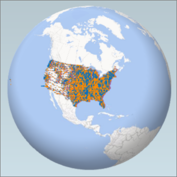
Power Map is an Excel add-in for Microsoft Office 365 Power BI subscribers that enables you to visualize geographic and temporal analytical data on a map. With Power Map you can display geographically related values on an interactive map, and create a virtual tour that shows the data in 3D.
Resources / Tutorials:
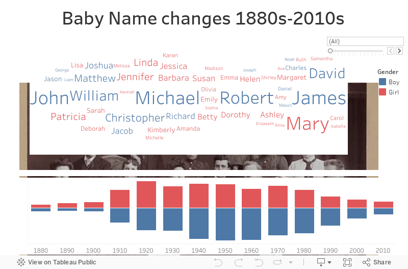
Tableau is an easy-to-use and powerful visual analytics tool that helps users create and distribute interactive visualization on its shareable dashboard. Tableau can connect to various files sources including relational datasets and Big Data sources for real-time update of the visualization.
Access:
Resources / Tutorials:
There are a variety of Python libraries that support visualization. Some popular ones include: Plotly, Seaborn, Matplotlib, etc. Each library has its focus and features.
Learning resources:
R is also a popular tool for data science projects. There have been a variety of statistical analysis and graphing packages created for R, some of the most popular ones include: Ggplot2, Leaflet and Plotly.